
PADEV ZENITH Premium HTML / CSS / JavaScript Template Ecosystem

Board 09 · Responsive showcase

One experience. Every screen.

Engineered to look exceptional, perform flawlessly and scale infinitely — without hiding a single essential element.

6 Breakpoints
12 Max columns
0 Hidden content
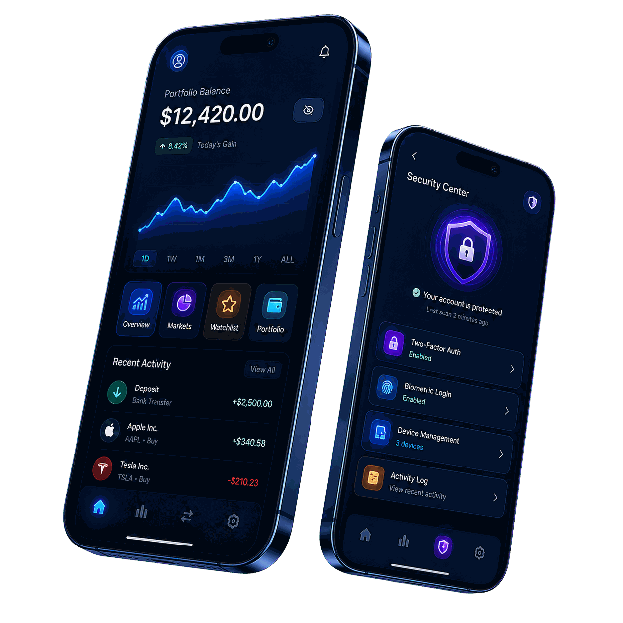
App showcase hero artwork

Section A

Breakpoint reference

The published ladder every surface is built against.

01Breakpoints
Breakpoint reference
WidthDeviceContextGridDisplay type
320pxMobileSmall phones4 columns28 / 1.2
480pxMobile largeLarge phones4 columns28 / 1.2
768pxTabletPortrait tablets8 columns36 / 1.15
1024pxLaptopStandard laptops8 columns48 / 1.1
1280pxDesktopLarge screens12 columns64 / 1.1
1440px+WideCinematic displays12 columns64 / 1.1
02Adaptive grid
12 column · desktop 8 column · tablet 4 column · mobile
03Behaviour rules
  • Columns reflow fluidly; they never jump a full breakpoint at once.
  • Wide state matrices scroll inside their panel rather than wrapping.
  • Navigation collapses to a keyboard-accessible drawer below 992px.
  • The brand focal object stays above the fold on every device.
  • No essential content is ever hidden as a shortcut.
04Component response
28.6KTotal users+12.5%
7.42%Bounce rate-2.1%

Resize the window: padding, type and density adapt, anatomy does not.